The message usually lands around nine in the morning, from someone in finance or ops: “Is the revenue dashboard broken, or is it just late?”
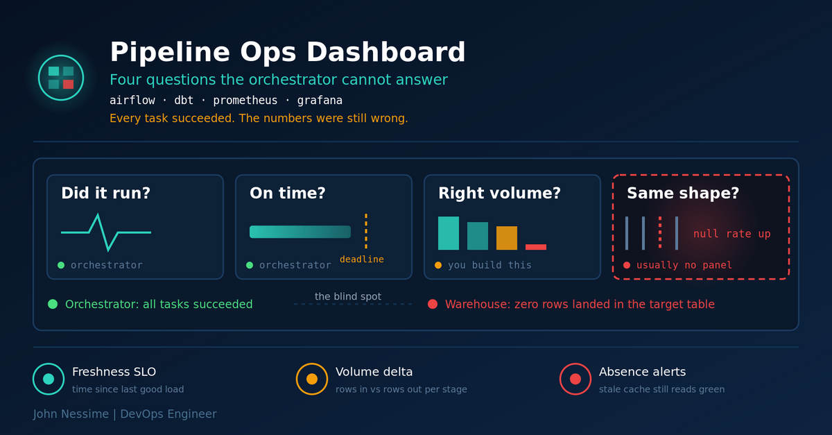
So you open the orchestrator. Every task is green. The run started on schedule, finished inside its usual window, exit code zero across the board. Nothing paged. And the numbers are still wrong.
That gap is the whole reason to build a data pipeline operations dashboard. Not to watch DAGs go green, which the orchestrator UI already does perfectly well, but to answer the questions the orchestrator structurally cannot answer. This post covers the four signals worth putting on a screen, where each one actually comes from, how to wire them into Prometheus and Grafana without inventing a metrics platform, and how to turn the panels into alerts that fire before a human notices.
Why green pipelines still ship bad data
An orchestrator tracks process outcomes. Did the Python exit cleanly, did the SQL statement return without an error, did the container terminate zero. That is a real signal and you should keep it. It is just answering a different question than the one your users care about.
Consider what a perfectly successful run looks like when the upstream source has quietly changed:
- An API starts paginating differently and your extractor pulls the first page only. It ran fine. It loaded 500 rows instead of 500,000.
- A source column gets renamed and your transform selects it with a
coalescedefault. It ran fine. Every row now says “unknown”. - A partition arrives late, so the incremental filter finds nothing to process. It ran fine. It did nothing.
- An upstream team backfills, and your dedupe key no longer holds. It ran fine. Everything is doubled.
None of those raise an exception. All four are visible in under a second if you are tracking row counts and freshness at the table level. This is the failure family that eats the most incident time, because the clock does not start when the pipeline breaks. It starts when a human notices, which can be days later, and by then the bad data has been copied into reports, cached in a BI extract, and quoted in a meeting.
The four questions a data pipeline operations dashboard has to answer
Resist the instinct to start from what your tools can emit. Start from the questions you ask during an incident, in the order you ask them. Everything that does not answer one of these is a second-page panel.
Did it run at all?
Sounds trivial, and it is the one most homegrown dashboards get wrong. A panel showing “last run: success” does not distinguish between a pipeline that succeeded ten minutes ago and one that succeeded eleven days ago and has not been scheduled since. You want time since last successful completion, as a number that grows, not a status pill that sits there looking calm.
Did it finish in time?
Duration matters less than duration against a deadline. A load that takes forty minutes is fine if the report is read at 9am and the run starts at 6am. The same forty minutes is an incident if someone moved the schedule to 8:40. Put the deadline on the panel as a threshold line, not in a runbook. Trending duration also catches slow decay: a stage that creeps from five minutes to fifty usually means data growth, a bad query plan, or resource contention, and it will breach your window eventually.
Did the right amount of data arrive?
Rows in versus rows out, per stage. This is the highest value panel per unit of effort on the entire dashboard. A drop from a million rows to twenty thousand is not subtle once you plot it, but it is completely invisible in an exit code. Compare against the same weekday from the previous week rather than against yesterday, because most business data has a weekly shape and Monday-versus-Sunday comparisons generate noise you will learn to ignore.
Is the data still the shape you expect?
Null rates, distinct counts on key columns, and schema changes. This is the panel almost nobody builds, and it is where the expensive failures live. A gradual rise in null rate on a joining key means an upstream system is degrading and your joins are silently dropping rows. You do not need statistical anomaly detection to catch that. You need the number plotted over time next to the others.
There is a fifth question that belongs on a different surface: what breaks downstream when this table is wrong. That is lineage, and it answers blast radius rather than health. Keep it one click away, not on the operations screen.
Where each signal actually comes from
Three sources, three different collection mechanisms. This is the part that takes an afternoon rather than a sprint, provided you do not try to build a unified agent.
The orchestrator, for run and timing signals
Airflow has emitted StatsD metrics for a long time, and that path is still the one most deployments run. Airflow speaks StatsD, so you put a statsd_exporter in front of it to translate into Prometheus format. Enable it in the metrics section of your config, or with the equivalent AIRFLOW__METRICS__ environment variables if you are on containers:
[metrics]
statsd_on = True
statsd_host = statsd-exporter
statsd_port = 9125
statsd_prefix = airflow
metrics_allow_list = scheduler,executor,dagrun,pool,triggerer
Two things worth knowing before you roll this out. First, metrics_allow_list is not optional at any real scale. Airflow emits per-DAG and per-task metric names, so without a prefix filter your cardinality grows with every DAG anyone adds, and you find out when the time series database starts struggling. Second, Airflow expects the StatsD destination to be resolvable at startup, so a scheduler that boots before the exporter can fail to come up. Order your dependencies accordingly.
StatsD has no concept of labels, so the exporter has to reconstruct them from the dotted metric name. That mapping file is the fiddly part:
mappings:
  - match: "*.dag.*.*.duration"
    match_metric_type: observer
    name: "airflow_task_duration"
    labels:
      airflow_id: "$1"
      dag_id: "$2"
      task_id: "$3"
The wildcards map positionally onto $1, $2, $3, and match_metric_type has to match what Airflow actually sends, timer versus counter versus gauge. Get that wrong and the metric silently never appears at the exporter, which is a genuinely annoying half hour of debugging. Check the exporter’s own metrics endpoint before you go looking at Prometheus, because if it is not there it never left Airflow.
Airflow also has a native OpenTelemetry path for both metrics and traces, which skips the StatsD translation entirely and gives you real labels rather than reconstructed ones:
[metrics]
otel_on = True
otel_host = otel-collector
otel_port = 4318
otel_prefix = airflow
otel_interval_milliseconds = 30000
The port there is the collector’s OTLP HTTP receiver, and you need an OpenTelemetry Collector or compatible endpoint in the path. If you are standing up a new stack, this is the one I would reach for, because the label problem disappears and traces give you per-task spans under a DAG run parent span, which is worth a lot during a slow-pipeline investigation. If you already have working StatsD mappings and dashboards built on them, migrating is real work for a modest gain, and the honest answer is that it can wait. Metric names do shift between Airflow major versions either way, so pin your dashboard queries to the metrics reference for the version you actually run.
Managed Airflow changes the plumbing but not the shape. On Amazon MWAA the metrics land in CloudWatch instead, and Google Cloud Composer and Astronomer each have their own export path. The four questions do not change.
The transformation layer, for data-level signals
If you use dbt, most of what you need is already being written to disk and thrown away. Every invocation produces run_results.json in the target directory, containing per-node status and timing, and dbt source freshness produces its own sources.json. The manifest.json holds the dependency graph, which is your lineage.
The cheapest useful thing you can do is parse the failures out at the end of the run:
jq -r '.results[]
  | select(.status != "success")
  | [.unique_id, .status, (.execution_time | tostring)]
  | @tsv' target/run_results.json
One trap if you run dbt in ephemeral Kubernetes pods: the target directory dies with the pod. Upload the artifacts to object storage as the last step inside the same task that ran dbt, not as a downstream task, or you will find your history is empty exactly when you want it.
Elementary is the low-friction option here. It installs as a dbt package with an on-run-end hook that loads the artifacts into your warehouse as ordinary tables, which means your dashboard can query test results and model timings in SQL alongside everything else. Great Expectations and Soda cover the same validation ground with more expressive checks and more setup. The commercial platforms, Monte Carlo and the vendors around it, add automated anomaly detection and column-level lineage across the whole stack, and the genuine case for them is that they find the checks you did not think to write. The trade-off is that you are paying per monitored table for statistical inference, and on a stack of twenty tables that inference is not telling you much that a row-count panel and a null-rate panel would not.
Without dbt, you write the check yourself and it is still short. One query per critical table, run on a schedule:
SELECT
  COUNT(*)                                        AS row_count,
  MAX(updated_at)                                 AS last_event,
  SUM(CASE WHEN customer_id IS NULL THEN 1 ELSE 0 END) AS null_keys
FROM analytics.orders
WHERE loaded_at >= CURRENT_DATE - 1;
Batch jobs, and the Pushgateway caveat
Prometheus pulls. Batch jobs finish and vanish long before a scrape interval comes round, so there is nothing to pull from. The Pushgateway exists for exactly this: short-lived service-level jobs push their results to it, and Prometheus scrapes the gateway instead.
cat <<EOF | curl --data-binary @-
  http://pushgateway:9091/metrics/job/orders_sync
# TYPE pipeline_last_success_timestamp_seconds gauge
pipeline_last_success_timestamp_seconds $(date +%s)
# TYPE pipeline_rows_loaded gauge
pipeline_rows_loaded ${ROWS}
EOF
Now the caveat, which is the single most common way a pipeline dashboard lies to you. The Pushgateway is a cache, not an aggregator, and it never forgets. Push a success metric, then have the job stop running entirely, and that success sits there being scraped forever. Your dashboard stays green because the last known value is green, and the fact that nothing has updated it in six days is not something a status panel can see.
Two defences, and you want both. First, always push a timestamp gauge rather than a boolean status, so staleness is arithmetic rather than inference. Second, alert on absence as well as on value, because the Pushgateway also exposes push_time_seconds per group, which tells you when anything last arrived regardless of what it said. Prometheus’s usual safety net, the up metric going to zero when a target disappears, does not apply here: Prometheus is scraping the gateway successfully, and the gateway is happily serving stale data.
Also keep instance identifiers out of the grouping labels. Push per service, not per worker, or you accumulate a permanent time series for every container that ever ran.
Laying out the dashboard so it works during an incident
The layout constraint is that someone is reading this at 7am on a phone with a stakeholder waiting. Three rows, top to bottom, in the order you need them:
- Freshness across everything. One panel, one row per critical table, showing time since last successful load against its threshold. If this row is clean, the pipelines are fine and the problem is elsewhere. That is a genuinely useful thing to establish in five seconds.
- Volume and duration per pipeline. Row counts with a week-over-week comparison, and stage duration with the deadline drawn on. This is where you localise a problem to a specific pipeline and stage.
- Data quality detail. Null rates, failed test counts, schema change events. This is where you work out what actually went wrong once you know where.
The freshness query in PromQL, given the timestamp gauge above:
time() - max by (job) (pipeline_last_success_timestamp_seconds)Grafana renders that nicely as a table with per-row thresholds, which is what makes the top row scannable. If you are self-hosting, Prometheus plus Grafana on a modest VPS from Hetzner, InterServer or DigitalOcean handles a surprising amount of pipeline metrics, because pipeline telemetry is low-volume compared to application metrics. Grafana Cloud’s free tier is a reasonable alternative if you do not want to own the storage, and Datadog or New Relic make sense if your organisation is already paying for one of them and you would rather have one pane than a better one.
Keep it to one screen. Every panel you add past that dilutes the ones that matter, and a dashboard nobody can read at a glance is a dashboard nobody opens.
Turning panels into alerts
A dashboard that requires someone to look at it is a dashboard that finds problems the morning after. The freshness panel converts into an alert almost directly:
groups:
  - name: pipelines
    rules:
      - alert: PipelineStale
        expr: time() - max by (job) (pipeline_last_success_timestamp_seconds) > 5400
        for: 10m
        labels:
          severity: page
        annotations:
          summary: "{{ $labels.job }} has not completed successfully in over 90 minutes"

      - alert: PipelineMetricsMissing
        expr: absent(pipeline_last_success_timestamp_seconds{job="orders_sync"})
        for: 30m
        labels:
          severity: page
        annotations:
          summary: "No metrics received from orders_sync"
The first catches a pipeline that is late or broken. The second catches the one that stopped reporting entirely, which the first cannot see, because an expression over a series that no longer exists returns nothing and an empty result does not fire. That pairing is the whole trick, and it applies to every push-based metric you collect.
Set the threshold from the deadline the data has to meet, not from how long the job usually takes. Ninety minutes is not “the run takes an hour so give it some room”. It should be the point past which someone downstream is materially affected.
Troubleshooting a dashboard that shows nothing useful
The metric never appears in Prometheus. Work backwards along the path, one hop at a time. Curl the statsd_exporter’s own metrics endpoint first. If the metric is not there, it never left the orchestrator, so the problem is the config or an allow-list that filtered it out. If it is there but not in Prometheus, the problem is your scrape config. Do not start in Grafana.
The metric appears with no labels, or with the DAG name baked into the metric name. Your statsd_exporter mapping did not match. Check the wildcard count against the actual dotted name, and check match_metric_type, which is the usual culprit.
Everything is green but the data is old. Classic Pushgateway staleness. Query push_time_seconds for the affected group and compare it to now. If it has not moved, the job is not running and you are looking at a cached value.
Volume alerts fire every Monday. You are comparing against the previous day on data with a weekly cycle. Compare against the same day last week using an offset, or exclude weekends from the baseline.
Gaps in the duration graph. If the metric is a timer sent only on completion, a run that is still going or that failed early sends nothing. That is correct behaviour, and it is why liveness needs its own panel rather than being inferred from the duration series.
Prometheus memory climbing after rollout. Cardinality. Per-DAG and per-task metrics multiply, and any label carrying a run identifier, timestamp or UUID creates a permanent new series. Tighten the allow list and drop the offending labels.
Common mistakes
- Treating job success as data correctness. This is the entire problem, and every other mistake is a variation of it.
- Pushing a boolean status instead of a timestamp, so staleness becomes invisible.
- Alerting on threshold breaches but never on metric absence.
- Building the dashboard before agreeing what “healthy” means for each table with the people who consume it.
- Instrumenting every pipeline at once instead of the three that matter, then abandoning the project when the noise gets unmanageable.
- Putting instance or pod identifiers into Pushgateway grouping labels and accumulating dead series forever.
- Alerting on things nobody will act on at 3am. An alert that gets acknowledged and ignored twice has trained your team to ignore it permanently.
Best practices
- Baseline before you threshold. Collect for two or three weeks and look at the actual shape of the data before deciding what abnormal means.
- Start with freshness on your three most critical tables. It catches more real problems per line of code than anything else you can instrument.
- Define freshness thresholds from the consumer’s deadline, and write the consumer’s name next to the threshold so the number has an owner.
- Version dashboards and alert rules in Git alongside the pipelines. A dashboard edited live in the UI is a dashboard that will be silently different next quarter.
- Emit row counts at stage boundaries as a habit, not as a special case. In versus out at each hop is what turns “the numbers are wrong” into “stage three drops rows”.
- Review alerts monthly and delete the ones that never fired usefully. Alert rules are code and they rot the same way.
- Keep lineage accessible but off the main screen. It answers a different question and it competes for attention with the ones you need first.
Frequently asked questions
What is the difference between pipeline monitoring and data observability?
Monitoring watches the process: did the job run, did it succeed, how long did it take. Observability watches the data the process produced: is it fresh, is there the right amount, has its shape changed. You need both, and the second is the one most teams are missing when they say their dashboards did not catch something.
Do I need a commercial data observability platform?
Not to start. Freshness, volume and null-rate checks on your critical tables cover most real incidents and cost an afternoon. Commercial platforms earn their keep when you have hundreds of tables, several teams changing them independently, and nobody with time to hand-write checks. The honest signal that you have outgrown the homegrown version is when maintaining the checks becomes its own recurring task.
Should I use StatsD or OpenTelemetry for Airflow metrics?
New stack, OpenTelemetry: you get real labels instead of reconstructing them from dotted names, and traces come along with it. Existing stack with working StatsD mappings, stay put until you have another reason to touch it. Metric coverage and naming differ between the two paths and between Airflow versions, so verify against the metrics reference for your version rather than copying a dashboard from a blog post.
How do I monitor a pipeline that only runs weekly?
Same timestamp gauge, much larger threshold, and lean harder on the absence alert. Infrequent pipelines are where Pushgateway staleness does the most damage, because the last successful push can sit there for a fortnight looking entirely healthy. Check push_time_seconds for those groups specifically.
What should a data pipeline operations dashboard show first?
Time since last successful load, per critical table, with its threshold visible. That one panel answers the question you will be asked most often, and when it is clean it rules out the entire pipeline layer in a glance.
How many alerts is the right number?
Few enough that every page gets investigated. If someone can name an alert they routinely dismiss without looking, you have too many, and the cost is not the noise itself but the habit it builds. Start with freshness and absence per critical pipeline, add volume, and only go further when a real incident shows you a gap.
Can I build this without an orchestrator like Airflow?
Yes. Cron jobs, Step Functions, GitHub Actions and shell scripts can all push a timestamp and a row count to a Pushgateway in three lines. The orchestrator gives you the run and timing signals for free, but it is the data-level signals that do the heavy lifting, and those come from querying the warehouse regardless of what triggered the load.
The one thing to take away
A data pipeline operations dashboard is not a nicer view of your orchestrator. It exists because the orchestrator can only tell you that a process finished, and the question you are actually being asked is whether the data is right.
If you build one panel this week, build time since last successful load, sourced from a timestamp gauge, alerted on both threshold and absence. It costs an afternoon, it catches the failure mode that hides longest, and it turns “is the dashboard broken or just late?” into a question you can answer before anyone has to ask it.
Need help building or fixing this?
I work with teams on pipeline observability and the plumbing underneath it. Things I regularly help with:
- Designing freshness, volume and quality checks for your critical tables, with thresholds derived from real consumer deadlines rather than guesses
- Wiring Airflow into Prometheus and Grafana, including the statsd_exporter mappings and the cardinality controls that keep it affordable
- Migrating an existing StatsD setup to the OpenTelemetry path without losing your dashboard history
- Getting dbt artifacts out of ephemeral pods and into somewhere you can query them, with Elementary or with plain object storage
- Auditing an existing dashboard and alert set to find what is stale, what will never fire, and what is quietly training your team to ignore pages
- Standing up a self-hosted Prometheus and Grafana stack on a VPS, or sizing a managed alternative if owning the storage is not worth it to you
If you have a dashboard that went green through an incident, send me the panel queries and the alert rules and I will tell you where the gap is.